Showing posts with label Teresa Collins. Show all posts

Monday, January 26, 2015

CHA 2015 Wrap Up Part Two: Papers & Stamps


Now that I have shown you my favorite tools from CHA 2015, lets move on to some musings about papers.

Graphic 45
If you know me you know I adore Graphic 45's style and generally love their papers, staples and all other products. So I won't spend too much time gushing about their new products and will try to stick to my three favorite new items. (But definitely go to their website and check out everything!) Of the three new paper lines (Artisan Style, Treasured Memories & Home Sweet Home) and two reprints (Once Upon a Springtime & ABC Primer), I am most looking forward to Artisan, I love the Art Nouveau look that incorporates architecture,  peacocks and text. And the colors are amazing. Stand by for seeing a few products in this line on the blog!  And the stamps are to die for. Check out the gold embossing on the new black tags!
And speaking of that another of the new announcements I am really excited about is that many of the staples are now coming out in black. From all sizes of the tags to the new multimedia albums and shadow boxes. And I am going to have to go with the shadow boxes and my third choice for best new items from G45 this year.
 They are so cool and come in two styles: a row of three boxes and a square of 4 boxes. I saw some amazing samples made with the shadow boxes.Check out the Vegetable stand Laura Denison made with a shadow box and the Home Sweet Home paper! OMG I want it ALL!!

The Year to Wander
There seem to be multiple lines called Wanderlust this year.

The first one I saw was by Heidi Swapp, It is a very pretty floral paper and I quite like it. But I don't really get a travel theme from it which is what I imagine a line name wanderlust to be.  But I do have to sat the big cabbage roses are gorgeous and could totally go shabby chic.

The second Wanderlust line I saw is by Kaisercraft. It is muchmore the travel line the name conjures up. But less of the flower and pretty I expect with Kaisercraft and more neutral or even masculine. 

The third Wanderlust line is more of a rumor I heard that one of Teresa Collins' new lines would have that moniker, but alas I did not see it.

UPDATE: Teresa Collins did post about her Wanderlust line on Instagram after CHA.

Teresa Collins
Speaking of Teresa Collins, she had a very nice booth that showed off a lot of her new products. She had customizable stamps, cell phone cases, new dies and embossing folders, even totes, But her paper lines were nowhere to be seen.
As she explains in her blog, somebody took all her samples. She also shared a photo of the galleys (?) of her three new collections: Glam Factor, Collector's Edition and Project Pink.  I am looking forward to seeing her new lines in person, her stuff is always great!

Prima/Frank Garcia

After the success of last year's Cartographer, Frank Garcia has designed a new paper line for Prima called Archivist.  It has a beautiful neutral palette with a vintage flair. I think this is the type of line that can stand on its own or be mixed in with another line. This line will come in multiple sizes from 12x12 to ATC sized cards and has some lovely matching embellishments.  Frank is also releasing a line of embellishments designed specifically for mini albums and a set of three different mini album blanks called Memory Hardware. This may be my go to paper for masculine projects this year.
 

Chickaniddy
The thing that impressed me the most about the Chickaniddy paper is the weight. It is one of the thickest weight papers out there. It could easily make a card with out any base. And whoa the way it would work in a mini would be amazing. This sweet and colorful paper will help make quick cards and projects without a cardstock base.


Bo Bunny
 Bo Bunny has added alot of cool new item this year. But lets start with one of their new paper lines, Carnival. I love circus and carnival themed paper and this one is awesome. With an old school side show font and muted primary colors thjere is just enough color to make it fun and vintage to make it work for kids and adults alike. It comes in 12x12 and 6x6 with many different embellishments.
Bo Bunny has also added more multimedia items including pearl pens, glitter paste, stencils, foil rub ons and laser cut chipboard. I was lucky enough to get in an open spot for their make and take which featured many of the new products.


So lets talk stamps!

DoCrafts/Gorjuss 
I adore the Gorjuss stamps. They are uber cute and feel kind of modern and vintage at the same time. They are made by a British company and distributed in the US by Do Crafts. I spied six new Gorjuss girls in the Do Crafts booth. And they are adorable, romantic and whimsical. All six come in sets with matching frames or accessories.  I always gotta have my Gorjuss girls!


Indigo Blu
Another British company, Indigo Blu makes some fabulous stamps with tons of details. This year I was stunned by their stamps of women's heads.
 
And how they used them with multimedia techniques. In fact they make some really cool papers and mixed media elements like their flakes.


LaLa Land Crafts
As usual LaLa Land Crafts had some super adorable stamps.  I was lucky enough to get to try many of the stamps and dies in their make and takes.  I really love the baby and flamenco collections Irina designed this year.
But my two mush have faves are I love you Marci and the square headz models. OMG so cute. Really want to decorate a Square Head!

So that is My report on (some) of what I saw at CHA, honestly there is a tone more I could write about, but we would all be here until April if I did.  I hope some of this information was helpful! Keep on crafting! <3 L

Monday, August 25, 2014

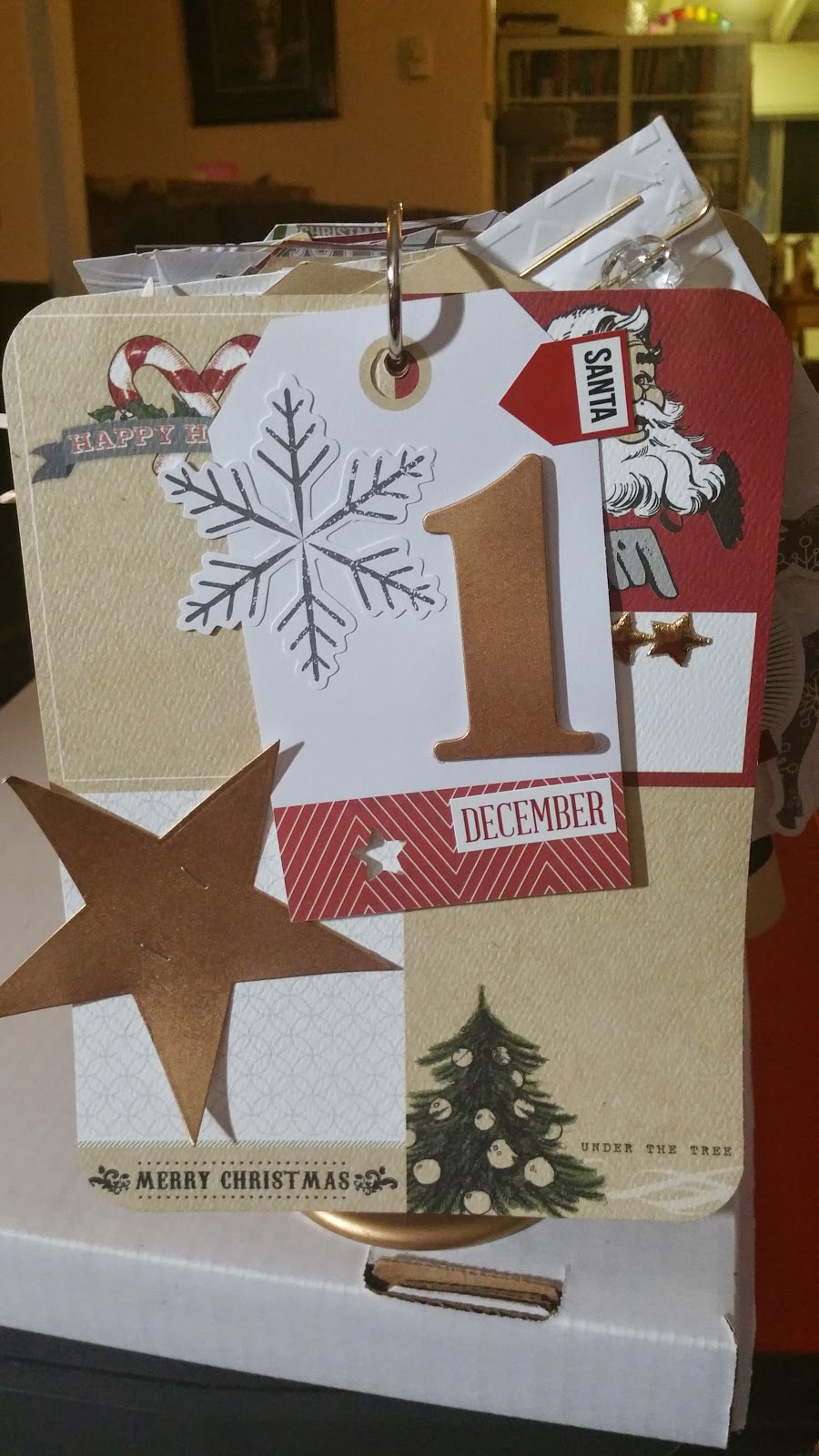
Teresa Collins Class at Scrapbook Daisies, Christmas Countdown Flip Album


I recently took anothervgreat class with the fabulous Teresa Collins.  This class was at Scrapbook Daisies in Xxx, Ca.  She was teaching a few classes on this trip to Southern, Ca, but the one I took was this beautiful and fun Christmas countdown, flip album with the Candy Cane Lane paper.


Teresa was such a sweetheart sharing sneak peaks of some of her new products, like Fiskers punches and scissors and he new dies and embossing folders with Craftwell. She is always coming out with something new and amazing.

 
The project started with a plastic frame from Ikea that we spray painted gold. (Side note: Her husband, who has been terribly sick, drilled the holes for the rings in all the frames. What a sweet and helpful man, right?) Along with some numbers from a chipboard set.


We then followed along with Teresa and her detailed photo guide to decorate all the tags and pages. I decided I wasn't crazy for the black letters in the kit and replaced them with sobe red Thickers.  I also added some of the new punch shapes, like love and feathers to the pages. And the snowflake rosette was different from original, but Teresa had suggested it. (Alot of people added it.)


I think it came out very nice and can't wait to display it during the holidays. It counts from 25 down to 1 and will be super nice to look at and change it everyday


Thursday, July 10, 2014

The Paper Phenomenon Files (Part 1) OR How I Learned to Embrace My Inner PITA and Became a Kathy Orta Fan.

A bunch of my friends were doing it but I wasn't sure it was for me. But the projects I saw were really cool and I I liked them . So eventually I decided I would try it too. And now I just can't stop. What am I talking about I'm talking about doing the Kathy Orta tutorials from paperphenomenon.com.

It started innocently enough. I decided to buy three tutorials on her website. The three I chose were the file m for memories, the vintage camera and the vintage typewriter. Now clearly I didn't choose the easy tutorials. I chose projects that were things that I wouldn't normally make. I wanted these to be projects where I learned something new. So I chose projects that were heavy on the construction which I hadn't done often.


First up with a vintage typewriter. The first step was to make sure I had all the materials and supplies I needed. After that I cut down all my chip board according to the instructions in Kathy's tutorial. And although there are a few moments where I struggled in the construction it wasn't very hard to follow the directions and put the typewriter together.


I did do one thing differently from the tutorial and added a small mini album to the inside of the typewriter instead of the calendar cards that were in the original tutorial. I used the Prima / Marion Smith Romance Novel paper for the mini album. It was based on a mini album in Kathy's Interactive Mini-Albums book. (I bought a digital copy from annies.com. It is aldo available signed on paperphenomenon.com)


I was really pretty thrilled with the end result. And was proud to give the typewriter and album to a friend of mine (who is a romance/ya writer) as a birthday gift. I also made another Vintage Typewriter for a friend as a graduation gift. (I used Graphic 45's  Bohemian Bazaar for the mini album.) I also put black painted grunge board over the "roller" of the typewriter on the second version, this gave it a very realistic look.


To make your own Vintage Typerwriter, you can buy the tutorial here at Kathy Orta's blog, paperphenomenon.com. And some of the hardware can also be purchased here at the blog shop. Many of the items are Tim Holtz items and can be purchased at craft stores. But getting them from Kathy can save time and having to buy extras. For the typewriter's keys, I bought laser cuts from PorkchopShow's Etsy store. (The black ones seem to fit better than the silver.)


The second project I chose to make was the File M for Memories album. One of the reasons I really like this album is that it is full of pockets.  I think that this makes the File M album a great gift for my non scrapbooking friends because they can use ot like a journal or diary. Notes, poems, drawings or just about anything can be tucked into the pockets with out having to add glues.


This level of complexity to the pages did make it a bit harder at first. In fact, I found this album harder to make than the typewriter. The trick for me was that I needed to see a page completed and understand how it worked. However, once I understood how the flaps and the pockets come together it was much easier to visualize and itn"clicked" for me. And then the process of construction for the rest of tne album went pretty fast. I was very lucky and met one of the women I crop with had made the album before and help me put together my first page.


I matted the album mainly with Kaisercraft's Telegraph Road but I also used some of their other lines like Kaleidoscope, BeYOUtiful and Storyteller because this album is pretty large and takes a lot of paper to decorate. I also used some of the Kaisercraft Captured Moments cards. (These are like Project Life or journaling cards.)  I think all the papers matched very nicely. I think sometimes when you use a group of papers all from the same company the colors and the themes can work well together. This project was also I gift, this time for a friend of mine who recently moved to China.


Some tips for making the album: Choose a file folder that has a nice large tab on it. I think this is a nice look for the album. (I decided not to use the printable templates in the tutorial.) Definitely make a template for matting the tabs (it should be slightly, 1/8 inch, smaller than the tab base.) That way it will look consistent, I did not do this and regretted it.


Another tip I learned that really helped was that adding a. thin layer of glue stick over the scor tape (or other double sided adhesive), gives an extra few seconds where you can move the item before it's fixed permanently.  This helped me a lot. I sometimes need a second chance, so this avoided alot of boo boos. In the tutorial Kathy used  Scotch wet glue to attach the pattern paper(snd it looked fab). I tried, but it didn't work as well for me(maybe I used too much adhesive). I then tried using a glue pen (Martha Stewart), but it seemed to stay a little too tacky even after it dried. I now use Scor Tape with the glue stick trick and it has been pretty successful.


To get the tutorial for the File M album at paperphenomenon.com go here. The main supplies you will need a chipboard cardstock and pattern paper. And since this is a nice big album you can use that whole line of pattern paper you have tucked away for just the right project.


The final project in my triptych of Kathy Orta projects is the Vintage Camera. This is the tutorial I was most intimidated by. Both because of the difficulty and the fact it was going to be a gift for my Dad and Stepmom. But this also made it the tutorial I looked forward to the most. And in the end had the biggest "pay off" for me.


I have to admit I did stray from the tutorial. The biggest change was using Kraft Tex instead of regular cardstock for the bellows.  For those of you who haven't used it, Kraft Tex is a paper/fabric hybrid. It is made from paper fiber, but has the strength, texture and durability of fabric. Heck you can even throw this stuff in your washer! So basically i followed the cutting, scoring and folding directions the same as Kathy gave for paper. The difference was that I had to score a little harder and use a strong wet adhesive. I used the brown Kraft Tex and painted it black with Tim Holtz' Distress Paint. I then distressed, sanded, repainted and distressed again until it had an antiqued leather look. It was a bit of work to get it just right, but it was SO worth it.


The second place I was forced to make changes was in the hardware. While most of the hardware is pretty easy to find, the Graphic 45 Staples Metal Tags are not. I was lucky and had a pack with all but one of the six tags. So i only had to replace one. (The "P" medallion at the front of camera base, under lens.) The metal piece that curves around the lens is sldo different. Instead of the clip for binding documents (which I could only find in a box of 100), I used a Tim Holtz metal word band and curved it gently with pliers.


I highly recommend that you have a really good trimmer that cuts medium to heavy weight chipboard before tackling this project. Some of the pieces are cut quite small and can be difficult without one.
Inside the camera is a really cute album. Since this was an anniversary gift, I used Teresa Collins' Save the Date (with a little You Are My Happy and Something Wonderful.) The angled pocket construction of the album is very striking and would look good as a stand alone piece.

 
I think the camera ended up being my favorite piece. I plan to make a couple more, including one for myself. The tutorial can be found here. It includes video for the bellows portion, so be prepared to play you tube on this one.


I hope you enjoyed this first foray into the Paper Phenomemon files of Kathy Orta. I really enjoy making these tutorials and plan on trying more. Let me know what you think. Have you done any of Kathy's projects? What are your favorites? Or is there a different paper craft
er's tutorials that you love?