Friday, March 14, 2014

Graphic 45 Design Team 2014 Audition

So it is that exciting time of year again, time for the Graphic 45 design team call.  This is the second year I am auditioning.  And I am very excited to find out what people think of my projects. This year I tried to make both unique one of a kind items,  some more conventional projects. and a couple that fall in between. I tried a bunch of new (to me) techniques and mediums in my creations this year.

So with out further ado, here are the eleven projects I am submitting for the 2014 Graphic 45 design team audition.

Olde  Curiosity Shoppe Puppet Theatre:

I have always loved the feel of the  Olde Curiosity Shoppe paper line, which makes me think of the The Imaginarium of Doctor Parnassus or the opening credits of  Oz, The Great and Powerful.  It has a weird, wonderful, wacky, creepy and fun vibe in the images and words used in its design.  To reflect that,  I decided to do a project that combines that feel with stamps like Catherine Moore's Doll Parts to create my own world of whimsy, weirdness, and wonder.

When you open the curtains of the puppet theater, you will enter five different quirky and amusing worlds. Each page has at least one puppet or doll that can be played with on the "stage" in front of one of the five set pieces- a ballroom, a forest, under the sea, a circus and the curiosity shoppe itself.  On the back of each page, there is a space to write the story of each of the puppets.  I  used various different multimedia techniques, such as modeling paste and stencils, to create dimension in each scene.
(I have included a You Tube video of me displaying the theatre and puppets.) 

Four 12x12 Layouts

I created four 12x12 layouts, trying to imbue each with a different feel.

"Cats" is a layout featuring Typography.  To create this look, t, I layered the paper's different patterns and colors with black card stock to create photo mats with visual depth and interest.  I added chipboard  and sticker embellishments from the line along with some enamel dots.  I feel like this ended up looking very clean for the amount of color and pattern that is on the page.
"Oscar Gold" featuring Curtain Call.  For this layout I fussy cut from the paper (one of my faves) and layered it with gold foiled paper and one of the new G45 washi tapes.  I love how this layout has the Hollywood glamour that suits the photo.
"California Gothic" featuring French Country. This layout is a humorous twist on the painting American Gothic.To create the 3D sunflowers,  I fussy cut matching sunflowers and crumpled one to add texture before layering them together .  I then added glitter glue and earl dots to each flower.  To finish the layout, I used buttons, and letter stickers.
"A Day by the Bay" featuring By the Sea -- I cut three of the blue papers into two inch squares to make a patchwork background.  I then used a stencil with Viva Décor Ferro to create the sand effect.  I layered over this a multitude of fussy cut shells and oceanic embellishments.  I finished with a piece of twine wrapped around the edge of the whole page.  What a great way to commemorate a day out with my father.

A Half Dozen Interesting Cards

These are six cards I created to teach during the past year.  They are all interactive or display style cards with fold or features that really show off a beautiful paper.  I have included the You Tube videos I made when promoting the classes.

Steampunk Spells Cascading Card and Typography Tag Card

Sweet Sentiments Pop-up Box Card and Couture Crosscut Triptych Card
Teresa Collins Napkin Fold Card (Tell Your Story) and Infinity Folding Card (You are My Happy)

A 12 Days of Christmas Exploding Box

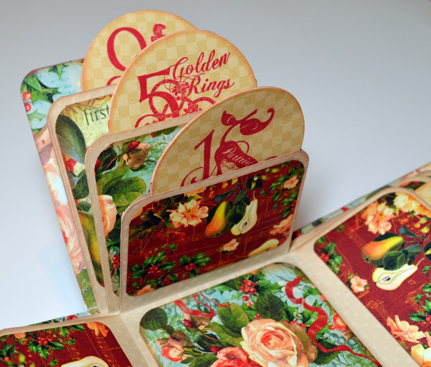
I used the stamps and all three sizes of the Twelve Days of Christmas paper to create this exploding box.  I added graduated rounded tags and stamped each of them with numeric stamps for each of the 12 days. The cover is decorated with fussy cut holly, fruit, and other elements.  This was originally created as an entry for Graphic 45's December Facebook contest.

Typography Desk Set

THis is a two piece desk set that has been altered using the Typography line.  The first piece, a pencil box made from a cigar box, was originally an entry for Graphic 45's Typography Challenge. The second piece is an altered pre-fab crafting desk set from KaiserCraft. On both pieces, after covering them with paper, I added some of my favorite sayings and quotes off the paper.  The I completed the look by embellishing the set with copper pipes, washers, and metal embellishments. I love this set so much I am already filling it with  crafting goodies.

Marie Antoinette Canvas

Inspired by the work of Julie Nutting, I decided to create a Marie Antoinette multimedia canvas.  I drew out my own pattern for the body shape. And then using Prima and other papers I crerated a period out fit from both cut and torn paper. In this piece I used quite a few mixed media techniques, including modeling paste for her hair.


Mad Tea Party Mini Album

Using my eClips paper cutter, I created custom tea party themed shaped pages.  I then bound them by hand and covered them in Halloween in Wonderland and Botanical Tea papers.  I really enjoyed mixing and matching the old and new lines for this project.  I also used the new shabby colored embellishments to create another bond between thru old and the new.  And the layered, bottom bound style of the mini album is something I haven't tried before, especially with the custom shaped papers.  I have a feeling it will be a favorite of mine to page thru for years to come.
(I have added a You Tube video of myself showing this album.)

Three Piece Suit Cards
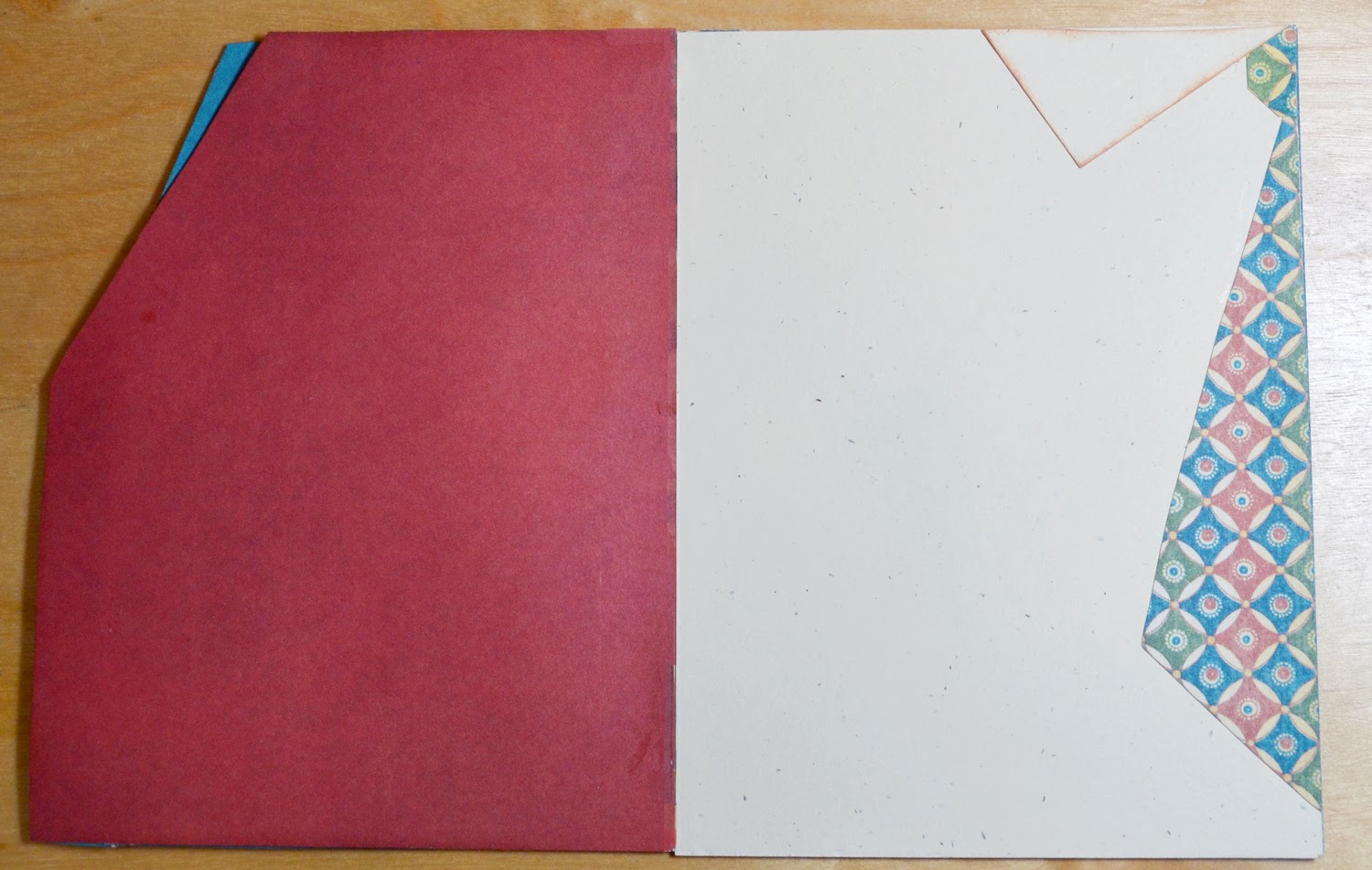
These are two really fun cards to make for guys that double as gift card holders.  The first one was created using the Proper gentleman collection and the second features the new line, Good Ol' Sport.  I was inspired to make them when I had several male friends' birthday parties to attend.  I really think they are clever and fun to give.

Steampunk Corset Apron

I created this altered steampunk apron for the 2013 So Cal Shop Hop. To make it, I hand drew an original image of a corset directly on the canvas apron. I then used a combination of paint markers, Sharpie, and a gilding pen to fill in the corset and background.   The functioning lace-up front was made using ribbons and eyelets.  I also added a faux leather trim, beaded fringe trim, and metal hardware and embellishments.  I think the finished piece has a fun trompe l'oeil effect.

Latched Book Box of Cards

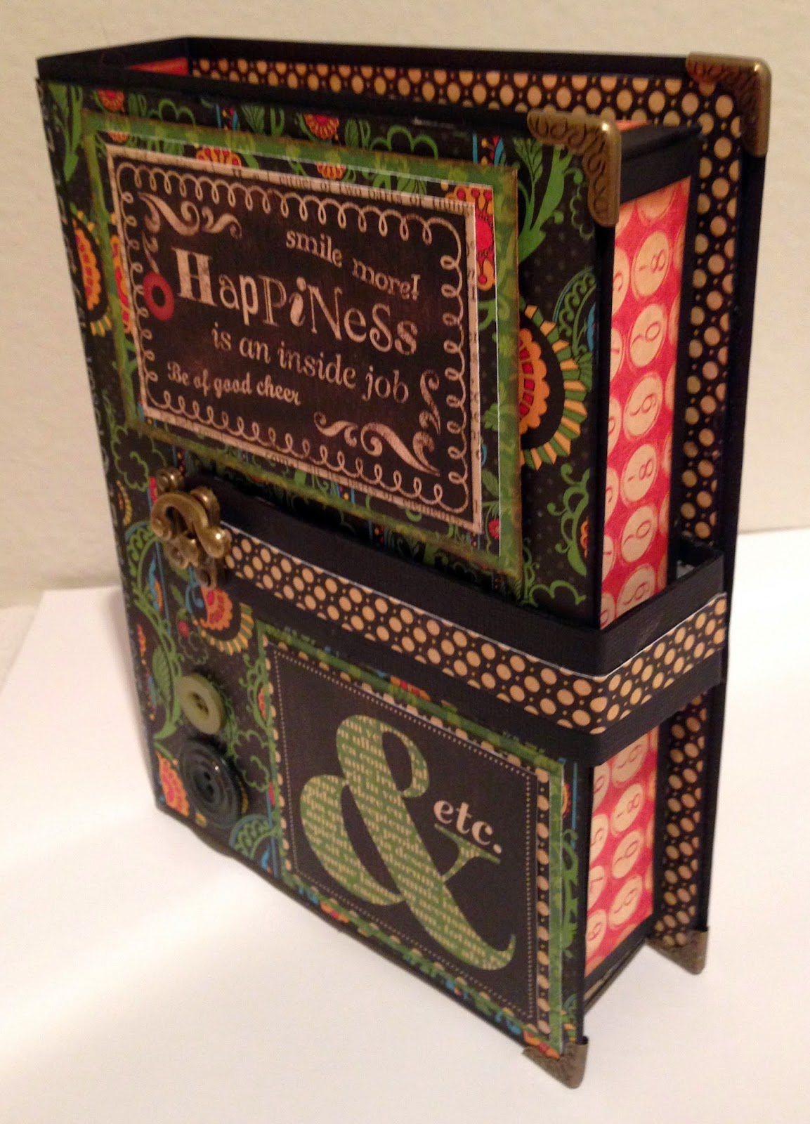
This set was created as a gift for my step brother.  I started by making a "book shaped" box using 12 x 24 black card stock and heavy chipboard for reinforcement..I cover the box with Typography paper.  The box also features  a latched band that holds it securely closed. To fill the box, I made  six 4x6 cards with the quotes from the paper line mixed with embossed core'dinations paper, buttons and brads.  It made a great "guy" gift that wasn't monotone or boring.

A Ladies' Diary Altered Shoes

To make these wearable pieces of art, I started with an inexpensive pair of flesh tone shoes and decoupaged the entire upper and heel of the shoe with small, torn bits from the A Ladies' Diary line.  I then added individual, fussy cut flowers over the patterns. To add a final touch I made a bow from the G45 fabric by Wilmington Prints with a large G45 Staples brad at the back of the shoe, above the heels.  I loved this project so much, I bought a second pair of shoes and hope to make a Couture pair - this time with video.

Thank you for taking the time to view my submissions for the design team. I hope you enjoyed seeing them as much as I did making them!


Wednesday, February 19, 2014

Interactive Card Class! 2 Cards Only $20!!

I will be teaching both of these super cool interactive folding cards this coming Friday- Feb 21 from 6-9pm at Perfect Day Scrapbooking in Huntington Beach. Call 714 369 2862 to reserve a spot.

The first card is a pop up box card using Graphic 45's "Sweet Sentiments paper."  It is a great card for spring and can be made with multiple sentiments.  And boy is this a cool technique to learn.


The second card is in G45's "Couture" line and is a tri fold shutter or x-fold card.  It is a nice format for a display card. And boy, does this paper look good on display with its pretty Art Deco 1920's style.


Still pictures do not do these cards justice, So I am adding a video of them, so you can see just how cool they are!!


For the class you will need: a trimmer, a score board, wet & dry adhesive, chalk ink in brown for edges, corner rounder, pop dots, fussy cutting scissors. I will have some of these supplies available for sharing.

Hope to see you soon! -L

Monday, December 2, 2013

Grateful for Tutorials to Try & a G45 Challenge

I hope everyone had a Happy Thanksgiving!! I had a great time with my sweetie and some friends.  And am both excited about the upcoming holiday season and a bit nervous about getting my craft gifts completed in time.  But one thing I will have ready are thank-you cards.

For November, Graphic 45 had a new challenge- making thank-you cards.  I decided to add my own twist to the challenge.  I decided to make cards from different tutorials I had seen, liked and bookmarked.  So here are the six thank-you cards I made plus a bonus birthday card.

Card #1 - Pop-up box card

For this card I used the Secret Garden paper by G45.
I started with the 6x6 pattern paper and added embellishments and
fussy cut flowers from the 8x8 and 12x12 designer papers. 
The "Thank You" stamp is by Just Rite. 
I first saw this card on Graphic 45's Facebook page (which linked here)
The original tutorial (which is what I based my card on) is here.

My conversions from metric to inches:
A4 paper =  11.7 x 8.3 inches
7cm = 2.75 inches (score at 2.75, 5.5, 8.25 & 11)
15cm = 6 inches.
(folded flat)


Card #2 - Infinity folding card

OMG! I had seen these and figured they would be so complex and hard to make. But the the tutorial I found made it so clear and had directions so simple that I want to make a ton more.

Here is the awesome tutorial.

I used the Communique paper and a Cas-ual Friday stamp.

Card #3 - Cascading card

 
 Another card that looks very complex and cool, but has an easy to follow tutorial.  I used G45's Steampunk Spells for this card.  I fussy cut balloons (larger in front smaller in back) and gears to decorate this card.  The stamp is by Just Rite.

The tutorial I used is here.
(I had trouble fitting the page in diagonally. so I used a ruler)

Card #4 - Tri-shutter card

I really like how this card turned out.  I think the fussy cut ladies and roses from G45's Ladies' Diary look so cool on this format.  The stamp is by Avery Elle.  The card looks nice closed and open on a table.  So I feel like this is a really cool style of card and I had never heard of it before.

The tutorial I used is here.

Card #5 - A Twisted card

I wasn't sure abot this card at first, but the pockets that the style made really made me think. There are so many cool things that can go in pockets! Tags or gift cards or movie tickets or photos...the list hoes on.  I used G45's Le Cirque and On the Boardwalk papers and fussy cut some bathing beauties for the pockets.  Stamps by Inkdinkadoo and Elle Avery.

Tutorial here. Watch whole thing for more ideas.

Card #6 - Napkin fold card

This card style was suggested by a facebook crafting buddy, Shannon.  I really wasn't crazy about the size and shape unfolded, but really wanted to make this card work.  So I changed it slightly from the tutorial and made it smaller. (I started with an eight inch square and scored at two inches from each side)  I mainly used the 6x6 Secret Garden paper with a couple fussy cut flowers from the 12x12 paper.  The edges arepunched with Martha Stewart's Scallop Three Dot punches. 

 I ended up really liking the smaller size and think it looks like a quilt...sorta.

Here is the tutorial. Video at bottom.

Bonus Card - "Birthday Suit" card

This card was done with th G45 Proper Gentleman paper.  I wanted to do a suit card, but couldnt fond one that was perfect. So I combined a cou[;e of tutorial I saw.  Stamp is Avery Elle.

I plan to play with this card idea more and maybe add a more detailed (tutorial?) post about it.

Tutorial 1 (in Estonian!)
_____________________________________

I hope you enjoyed seeing the tutorials and the cards they inspired me to make with Graphic 45's beautiful paper.  What are some of your favorite card styles? I would love to learn some more new styles!

Thursday, October 10, 2013

My Methods for Copic Skin & Hair Part 2: Darker & Curlier

This is part two of my Copic technique.  Again I can;t say if I am doing this the proper way.  I am not Copic certified or anything but self trained.  I learned most of what I know about drawing and shading from years of practice and learning how to look at objects in real life.  To be honest I think that is where you can understand shading the best, by looking at a photo and seeing where the lights and darks fall.  In theis post I am going to go over a darker skin tone, black hair with Cool grey and how I color curly hair,  I am using another digi stamp image by La-La Land crafts.  It is called "Coloring Marci." (Again, please respect the artists and designers of these wonderful stamps.)
These are the colors that I have choosen for my skintone. E11, E13, E15 & E18.  I begin by laying down E11 (the lightest color) over the whole face.  It is ok if it is a bit streaky because there will be additional layers of color to cover it and even it out,
I added a shadow in E13 around the edge of the face and below the hairline to start giving depth.
I then blended the shadow using E11
   
 I then added more depth by making a darker shadow line in E15.
 And blended it with the E13 and E11.
 (For a medium skin tone you could stop here and make sure everything is well blended.) I added a final layer of shadow with the E18.
And i blended it with the E15-E11 pens.
For blush and lip color I used the E04.
 Now I am ready to color the hair.  I am starting with the area above the headband.
And for the black hair I am using: C9, C7, C5, C3 and C1
I started with the C7 along the top for head and behind top of headband. (This part will be similar to the straight hair we did in part 1.)
 I followed that with a layer of the C5.
 Then I blended in the C3.
 And lastly the C1 was blended in.
 I then added a scond layer of color over the first.  I started with the C9. to make the hair even darker.
 I then blended in the C7....
 C5, C3....
 and C1. And that finished the top part of the hair.
Now using the same set of colors I am starting on the curls at the bottom.
Using the C9 I start by deciding where the darkest parts of the hair would be.  I choose to make shadows below the headband, at the back of hair (by neck and behind shoulders), beneath the ears, the tips of the curls and anywhere the hair goes behind other hair. 
 I then blended that out in the direction of the curls with the C7.
 And the same with the C5.
 And then blend in the C3.
 And finally the C1. 
 And here is finished coloring of the darker skin and curly hair on the La La Land Craft's "Coloring Marci" stamp.
Thank you with sticking with me through two long tutorial posts.  I hope they help explain my thought process when coloring hair and skin with Copic markers.  I am going to add some other projects where I have used these techniques at the bottom of the post.  And I would love to see how you color hair and skin.  Have fun crasfting and coloring and I will see you again soon!

Another LaLa Land Crafts stap "Winter Marci" I colored her lips a deeper red here.

Here is one of the Gorjuss girl stamps with the darker hair and a much looser curl.