Thursday, July 18, 2013

Corset Apron Design fo So Cal Shop Hop

 This year's Shop Hop theme is What's Cooking.  So this year we are decorating canvas aprons.  It took me a while to decide what to do; There are alot of cool things you can do with aprons.  I decided I wanted to go steampunk since I like that style and would be more likely to wear it again.  Then I got some inspiration from a Betsey Johnson tee shirt with a corset drawn on it,  So my final idea was a hand draw steam punk corset.

First thisng was to sketch out the corset on the apron.  I used the back of the apron because I didnt want to pockets in the middle of the corset.  I then went over my lines with a brown paint pen and started a bit of shading that would create depth.  To fit with the the steam punk theme I filled in the seams and boning with a copper gilding pen.

I then filled in the "fabric" part of the corset with an olive green paint pen.  I also added a necklace to the top of the apron and began filling in the background black.  This took several Sharpie markers.  I recommend the "magnum" for this much coverage.

 After I finished coloring/painting, I covered the edge of the apron and the neck strap in a faux suede.  I also added grommets down the corset front which I laced with green ribbon decorated in peacock feathers.  I decided to replace the drawing of a necklace with one made of a cameo embellishment and some bling. I think it looked way better.

 I added a glass bead fringed ribbon to the bottom of the corset. and re gilded all the boning and edges with the copper pen.  For finishing touches I added some steampunk themed embellishments like keys. gears and butterflies. I also replaced the tie with the green peacock ribbon.

 Finished apron.

Hope you enjoyed my So Cal Shop Hop apron project.  It was sure fun to make and I think it came out super cute.  I wonder what I will make next year....


Thursday, June 20, 2013

Playing and Learning with Copics and LaLa Land Crafts Images

Lately I have been enjoying using my Copics to color some of my La La Land Crafts (digi) stamps.

 I print out my 'digis' on my HP printer in black ink only.  I have been testing different papers and so far I like the Crafter's Companion Ultra Smooth Premium White cardstock and Bazzil Card Shoppe in Marshmallow.  I usually let the print outs dry overnight and sometimes also heat set the prints using my heat tool as if i was embossing the images.  This helps to avoid the black ink from the printer smearing and ruining the image or the tips of the Copics.  (If you use regular stamps I recommend Memento ink. Don't use StazOn because it can ruin the marker tips,)

Two of the projects I worked on were for La La Land Crafts' Facebook group's "Red White & Blue /. Fourth of July" contest.  The first card uses the hero stamps - "Star Boy Luca" and "Super Cupcake Marci."  I printed them both out and cut them off page loosely so i could have a smaller piece of paper I could move to different angles while I colored.
 
I started with the Marci image.  For her skin I used E000, E00, E21 and E11 with R20 as blush. (I will post a tutorial with each stage pictured in future--promise!) I continued to do the rest of her skin tones in the smaller areas.  I then did her bright red hair.  I color hair from the darkest (shadow) area to the lightest (highlight) area. So, for Marci's hair I began with R37 at the roots, tips and also where the hair curves in near her ears.  Working toward the highlight, I blended to R35, then R22 and R20 (highlight color)  I went over this a second time adding some R39 to the darkest areas. I colored in Luca's hair blue. (B37, B34, B24 & B21.)  Since Luca's hair is straight, I work from the roots (dark) and the tips (dark) with a highlight in upper to middle area.  I will some times use the lightest pen to draw a curved line where the approximate location of the  highlight should be.
I used R24 as the main color for the red clothing adding some R29 as shadows and R22 as highlights. My shading group for the blue clothes were B00, B02, B05 and if needed B06.  I thought this was a nice bright and fun blue for a super hero.  I then shaded the "white" areas (his shirt, her belt & gloves) with N0 & N2.  I started with N2 in darker area like edges of belt and blended out with the N0.  I then added a few extra colors, some pink and yellow for Marci's cupcake emblem, yellow on Luca;s safety pin and belt and red and blue for his star symbol.  I also added some glitter to the cupcake and star (its hard to see in photo.)
While the glitter was drying I built my card.  I decided to use a neutral base of a beige paper with stars over that I layered a red and white stipe paper and a bright blue with multicolor polka dots.  I then added red white and blue ribbon and my sentiment, "You are my hero."  I slid a circle with a star on it behind the ribbon.  But it turns out I really didn't like the circle. (lol)  So covered that with flowers and buttons in the red white and blue color theme.  And I liked that a bit better. Which version do you like?

 I also did a second card with the Luka stamp "Best Friends."  It is a really cute stamp of Luka with his dog.  I used the E000, E00, E21 and E11 combo for the skin again.  I also used the same R29, R24 and R22 combo for his red hoodie.  For his hair I used (from dark to light) E29, E27, E25 & E23.  On his puppy I used E87, E84 & E81 for the main fur color.  I added some E39 & E37 for darker spots and some Y32 to the yellowish spots.  For his jeans I used B97, B95, B93. These are a very grey blue and make awesome jeans.
I went pretty simple for background.  I used Authentique's Genuine paper for the jeans with tag on top of red & white polka dots.  I then stamped my sentiment and added the 4 brads and was done.  I really like this card I think its simple straightforward and cute with out being girly.

But speaking of girly...the last La La Land crafts and Copic Marker card I worked on this week was a thank-you card for a special friend.
 I used the Dress Up Marci stamp.  It is so cute with the over sized pumps and pearl necklace. For the darker skin tones I generally refer to the tutorial on La-La Land Crafts. (here) The colors they use are E11, E13 & E18.  For the hair I used C7, C5, C3 & C1.  With hair this curly I just try and decide where I think the darkest part of the curl is and work around it in the light to dark shades.  I decided the hat and shoes would be cute in purples. I used V12, V15 & v17 here.  I tried to keep the edge of brim the highlighted area on the hat. 
I did the dress in the same bright blues I had used on the super heroes. B00. B02 & B05.  The ribbon on waist and sleeves matches the hat coloring.  I also colored the flower in pinks. (R81, R83, R85)  On the necklace I added platinum colored Stickles. To complete the card I added some paper flowers and a doily from the Martha Stewart punch on a pre glittered gold card.

I thought Marcie looked sweet and liked how the colors looked together.  What do you think?  Do you have a favorite skin tone blending set for Copics or Spectrum?  I would love to know what you use!

Monday, April 29, 2013

Tutorial: Paper Teacups Filled with Flowers...Makes a Cute Mother's Day Gift

I wanted to share these really cute 3D teacups filled with rolled paper flowers.  I made these two at a crop this weekend, and think they are going to make awesome Mother's Day gifts!  I made two styles and will be going over the smaller "Demitasse" type cup first.


The smaller teacup is from the Cricut cartridge "Tags, Bags, Boxes & More 2."  I cut it on my (new) Cricut Expression 2 on Craft Room at 7 inches wide.  This gave me a nice size for a cappuccino type cup.  When cut out the flat pieces look like this.


This will give you a handle, cup and bottom of the cup and 2 circles that are used to make the cup stay round and cover up glued seams.  I used the "Floral" pattern from Glitz' "Yours Truly" line for my teacup, I liked the patten and colors for a teacup.


To assemble the cup, glue or tape (I used scor/sookwang tape in 1/4 inch size) the tabs on the edge of the cup and base to round them.  I used the tabs as a guide and tried to match the spacing.  (Note: the piece I used as the base of the cup could be flipped and used as a saucer.)  Depending on the look desired, you cand trim a bit off the base to make it rounder or smaller.  After gluing I bent the tabs down on the bottom of cup and base so they looked like above.


I choose not to glue the handle but just to fold it in half and insert it in the slots.  I had to gently lengthen on of the slots with a small scissors to get the tabs on the handle in.  I then put glue (I used 3in1) on the tabs on the cup and glued the base to the cup. I then inserted the smaller circle into the bottom of the cup and the larger circle into the top of the base and glued them in to cover the tabs and make the cup look rounder and more finished. (you wont actually see these pieces and as you can just see, I glued the one in the bottom of cup in upside down.)


There is a big seam where they meet, I am sure if you are more careful and tidy than me that this seam would be lessened or avoided. I fixed it by gluing a piece of lace trim over the seam.  I also cut 2 more circles out of the same pattern, one at 1.125 inches and one at 1.5. I glued the larger one to the bottom of the base to make sure it had a good flat base to sit on.  The smaller piece I cut slits around the edge and crated tabs. I then bent the tabs and glued it to the top inside of the teacup to create a base for the flowers to sit on.  Again it doesn't have to be super pretty or perfect, it will all be hidden by the adorable rolled flowers. On this cup I inked the edges of the cup with Biscotti color Powdwer Puff chalk because I wanted a antique old world look.


The last step before making the flowers is to add something to give the flowers some body and shape, like a floral "bump it."  Here I used a circle that had cut badly that I turned into a cone.  I cut 2 slits at the top to flatten the point of the cone.  You could also use a half Styrofoam ball, floral foam, tissue or what ever you have on hand that works for the size and shape of your teacup. I added some pop dots under the middle of cone (like 6 or so stacked) to make sure it would hold and stay put.


Now its time for flowers!! This is the fun part to me.  I cut various types of rolled flowers from the Flower Shoppe, Artiste and Art Philosophy Cricut cartridges.  I used widths from 4 to 2.5 inches to make smaller flowers.  Now if you don't have a Cricut many of the die manufacturers like Sizzix and Spellbinders make dies for flowers or there are some precut ones by Imaginisce.  Or you cant tear/cut your own spirals to make rolled 3d flowers, I found a bunch of tutorials (like this) when I Googled "spiral flower tutorial."


So I cut out some different sizes and styles of flowers. I used American Crafts' Dear Lizzy 5th and Frolic "Pretty Parkway" paper for all the flowers on this teacup.  (I rolled some with the blue on the inside and some with the white on inside.) I also choose to chalk the edges of the spirals for the aged look.


If you haven't made rolled flowers before, here is my method.  I used a twilling tool or tweezers. (Here I used a locking forceps style tweezers because I forgot my twilling tool when I packed for the crop I was at.) Gripping the small end (outer) end of the spiral in your tool, start winding it or rolling it.  On most flowers the color on the INSIDE will show the most.  once you have the whole thing rolled around (except base/bottom larger center), take it out of tool and loosed flower to get the look you want.  Some people like really tightly wound flowers, I happen to like them a bit looser and unwound. Make what looks good to you.When you get to the end of the spiral you will see there is a large "circle" or other shape that will be the base of the flower. Put some heavy liquid glue or a big glue dot or glubber on it and glue your rolled and shaped bloom to it. You can now shape the petals and flower however you like, I tend to flatten some of the a bit. Voila! A flower.  Now make a whole bunch. :)


After you have a bunch of flowers made, it is time to fill your cup.  I started with the biggest flowers and put them toward the center. I continued too add the flowers from larger to smaller filling in the holes until you couldn't see the inside of the teacup.  To cover the seam I trailed some flowers down the cup like it overflowed.  I did not add any more embellishments to this particular style.


I also made a larger variation with a doily type saucer.  I used Glitz' Cashmere Dame line in Floral for this teacup.  I also embossed the paper to give it a fine bone china look. ( I used Anna Griffin;s Cuttlebug folder in Rosa.)  I wanted this teacup &flowers to have more of a English (Victorian?) high tea look.


I did most of the flowers with the same Cricut cuts, but this time made the a bit larger- like up to 5.5 inches.  I also used several different paper patterns, including Dear Lizzy and Prima.  I did not chalk the edges of the flowers.


For the teacup I used a Sizzix die designed by Brenda Walton with my Big Shot Machine. This cup has a more angled shape with scalloped edges. It gave me almost the same pieces when cut. The circles are smaller, but work basically the same way one one inside and one on bottom of cup. And the tabs on base glued to the side of cup on this version.


The Brenda Walton die has a handle that is made if a strip of paper that is rolled in an "S" Shape and glued to cup. I used the seam of the cup as guide to get the handle straight on cup. (as a bonus it hid the seam a bit.)  There is also one additional detail- a teabag label.  I used my tiny attacher and stapled it to some matching bakers twine and  hung it over edge of cup near the handle.  I used a semi blank paper for the tag and wrote my step-mom's initial and my happy mother's day sentiment on it.


After placing the rolled flowers, I filled in the spaces that remained with premade flower from my stash, mostly Prima and Petaloo ones.  I especially liked the small flat blooms for the tiny crevices. (The paper I used had a yellow back and made the inside practically glow.) I also inserted some Prima leaves along edge and between some flowers. After I had the flowers how I wanted them, covered the teacup part with a paper towel and sprayed the flowers only with shimmery Goosebumps texturizer. I then sprinkled Fairy Dust glitter in Sugar Shimmer over it.  This gave it a sugared flower candy look I really like.


For the saucer I cut out a 4 inch and a 6 - 6.5 inch doily on my Cricut using the Teresa Collins Basics digital cartridge for Craft Room.  (For the saucer I used Glitz' Floral from Yours Truly) on the 6 inch one I cut off a "pie piece" from one of the scallops and removed the center circle.  I then glued the edged together to make it slightly rounded.  I glued the 4 inch doily in the center to cover the hole I had cut and make a flat base.  I then glued the teacup in the center. (Ignore the circle under the cup-I originally made a plain circular base ans was scared to detach it.)  I added a couple of flowers that I glittered individually to the saucer to cover the seam.

So those are the two styles of posey filled teacups I made over the weekend.  I am hoping they make make for a nice Mother's Day gift of flowers that will stick around for a while.  What are you doing for Mother's day this year?

Until next time, stay sweet! - L

Materials used:
Dies/Cricut: Sizzix Brenda Walton Teacup die, Cricut Artiste, Art Philosopy, Flower Shoppe, Tags, Bags, Boxes & More 2 and Teresa Collins Basics digital
Papers:Glitz: Cashmere Dame Floral & Yours Truly Floral, Dear Lizzy: 5th & Frolic Pretty Parkway
Inks/Glitters/Paints: Qick Quotes Powder Puff Chalk in Biscotti

Tuesday, April 23, 2013

Working on a New Class Part One - October Afternoon Sarsaparilla


I am just finishing up a new mini album I am going to teach at Perfect Day Scrapbooking. I do not know the dates, but will keep you updated.  This is part one, the cowboy/masculine themed mini album.  I am using October Afternoon's Sarsaparilla 8x8 paper and matching embellishments.

Here are some photos of the full album.


The cover features a die-cut sheriff's badge with some masked misting and buttons.

It's blackjack when you flip it open and see the super cute stickers
and chipboard embellishments in the Sarsaparilla line that are included
in the class (There are leftovers in the kit that you can use later.)

On the first square page there is a kerchief pocket that holds two tabs.

 And then its off to the rodeo with bigger photo mats and colorful
embellishments, some of which were given added oomph with pop dots.
 On the last square page there is a gorgeous cloudy paper with a fenced in photo mat.


 And on the back cover is a buckaroo from the chip board stickers wishing
you and yours " Happy Trails!"

 I am super happy with how cute this mini turned out and think it will be a fun class to teach.  I will be posting more info like the date and time.  Also keep an eye out for part two of my October Afternoon classes coming soon to a blog near you.  And by that I mean this one!


Thursday, April 4, 2013

My First Class & A New Card

I taught my first class last night!! I taught two lovely ladies from Montana how to make the Carta Bella Well Traveled Mini. (Full blog post of book here.) It was really fun and I think it went well.  I hope I get a chance to do some more classes in the future.  Rachel still has some paper and I can put together a kit with instructions if you need one.  Just call Perfect day Scrapbooking in Huntington Beach (link to the right.)  And just to remind ya, the mini looks like this:


Also I have a new card to share.  I used the new G45 paper called French Country.  The base is a 4 x 6 kraft card.  Over that I added a piece of Tim Holtz coredinations paper  in a dark green. I embossed that with the Spellbinders M-bossiblities folder Ornamental Iron (#EL-019.)  I lightly sanded it to bring up the pattern and distress it a bit more.  On top of that I have layered a card from the A La Carte paper in the French Country line.  It is the sunflower border around a lined list, but the list part is covered.


The top later is a tag/envelope combination from the Tags & Pockets set.  The tags and pockets are new with the G45 2013 collections and I love them- what a great idea.  The different tags and envelope/pockets can be used together or separately and you can mix and match them a bit.  I used the sunflowers pocket and added some gold dots with a Viva Decor (Splash of Color) pearl pen along the scalloped edges. And I used the tag with the strip of roosters across it.  I attached lock and key embellishments to the tag with some lace ribbon. (with the tag removed you can see the top of the list on the A La Carte card.)


On the inside of the card I added the full sized sunflowers from the Sunflower paper.  On top of this I added a piece of the green paper from the co-ordinating 6x6 G45 pad.  I stamped the green paper with the bee and crown image from the G45 French Country Three set and the "thanks a lot" sentiment from the French Country Two set.  I did both of these in a black ink. (All the French/ English sentiments on all the stamps sets in this collection would work well for cards.)  And at the top of the card I added a green faceted rhinestone embellishment.  I think this basic layering set up would work for a lot of different types of cards in both the French Country and Secet Garden lines with the Tag Pocket sets.  On the Secret Garden you could use the stamps that say the flower and its meaning on the inside.  I am hoping to make some samples of different takes on this card, so check the blog for more!


In some less happy news, I didn't make the top 30 of the G45 design team call. But I still feel pretty proud of the item I made for my audition. And there is always next year.  And I at least learned that I don't have to make all the projects between the announcement and due date like I had done this year. So, for 2014 I am starting early.....like tomorrow. lol

Hope you liked the card, let me know what you think in the comments section below or my Twitter or Facebook on the right!
<3  -L

Materials used for card:
Papers:Graphic 45 French Country (A La Carte, Sunflower, Tags & Pockets & 6x6)
Inks/Glitters/Paints: Colorbox creamy brown chalk for edging, Viva Decor (Splash of Color) Gold pearl pen
Other: Lock, Key & green rhinestone embellishments


Thursday, March 21, 2013

Graphic 45 Design Team 2013 Audition

As I finish up my Graphic 45 Design Team application, I am filled with pride, happiness,  some anxiety and lots of gratitude.  I am happy and proud that I not only finished six brand new projects for this application, but that two of them were entirely new areas of crafting to me. I am also a little nervous because this is my first design team call.  But most of all I am grateful. Grateful for the opportunity to apply for the G45 design team. And grateful to all my friends and family who have supported me as I created these projects.

So without further ado, here are my G45 Design Team projects.
Thank you again,
Laurel


1. A Ladies' Diary - Birthday Card
I made this card for my Stepmom's birthday.  I was inspired by some vintage lace I had purchased and the beautiful subdued hues of A Ladies' Diary. The card has multiple folder style panels, a cut out window, removable tags, detailed fussy cutting and a mini envelope.  I think it has a vintage elegance my Stepmom will love. For a more detailed description of how the card was made see the full length post.


2. Curtain Call - Interactive Mini Album & Matching Altered Box
This Graphic 45 Curtain Call album with matching box is my tribute to my Dad.   The sepia toned images of films , cowboys and music match up with his personality perfectly.  I loved adding multiple flaps, pockets and tags to the album, so there is a hidden secret on every page. Even though I made it the album the interactive features make it seem different every time I paged through it. Finding the perfect sized cigar box to make a matching case was a great opportunity to make my first altered box. And it turns a mini album into a coffee table dispay piece my Dad can share with all his friends. To see the full album and how it was constructed please read the full length post.


3. Bird Song - Altered Cigar Box
Bird song is one of my personal favorite papers. I used it to make a his and hers jewelry box that sits on my bed side table. At first it was hard to decide what embellishments and decorations to use with the paper, but it became easier when I added the vintage chopsticks and metal flowers.  I also used decoupage medium on the entire box, which taught me a lot about what not to do (glue the entire page to the box- not the edges) and to be patient (the bubbles and waves to disappear as it dries.)  I am really proud of how this altered box turned out and that I learned some new techniques for the future. To read more about these techniques and see additional photos, see my full length blog post.


4. Two Carta Bella Mini Albums - Well Traveled & Traditions Papers
These two mini albums became a challenge I gave myself.  Build two similar albums, but on one use the Cricut or any machines I wanted and on the other use only hand tools like a scoreboard.  I found it was fun to try and figure out how to achieve some of the same kinds of effects manually. Maybe I couldn't quite get the complex shapes of the Cricut, but I could still layer the pattern paper and add hidden nooks.  I think both albums are really cute and fun. For more information on the differences and similarities of these albums check out the full length post.


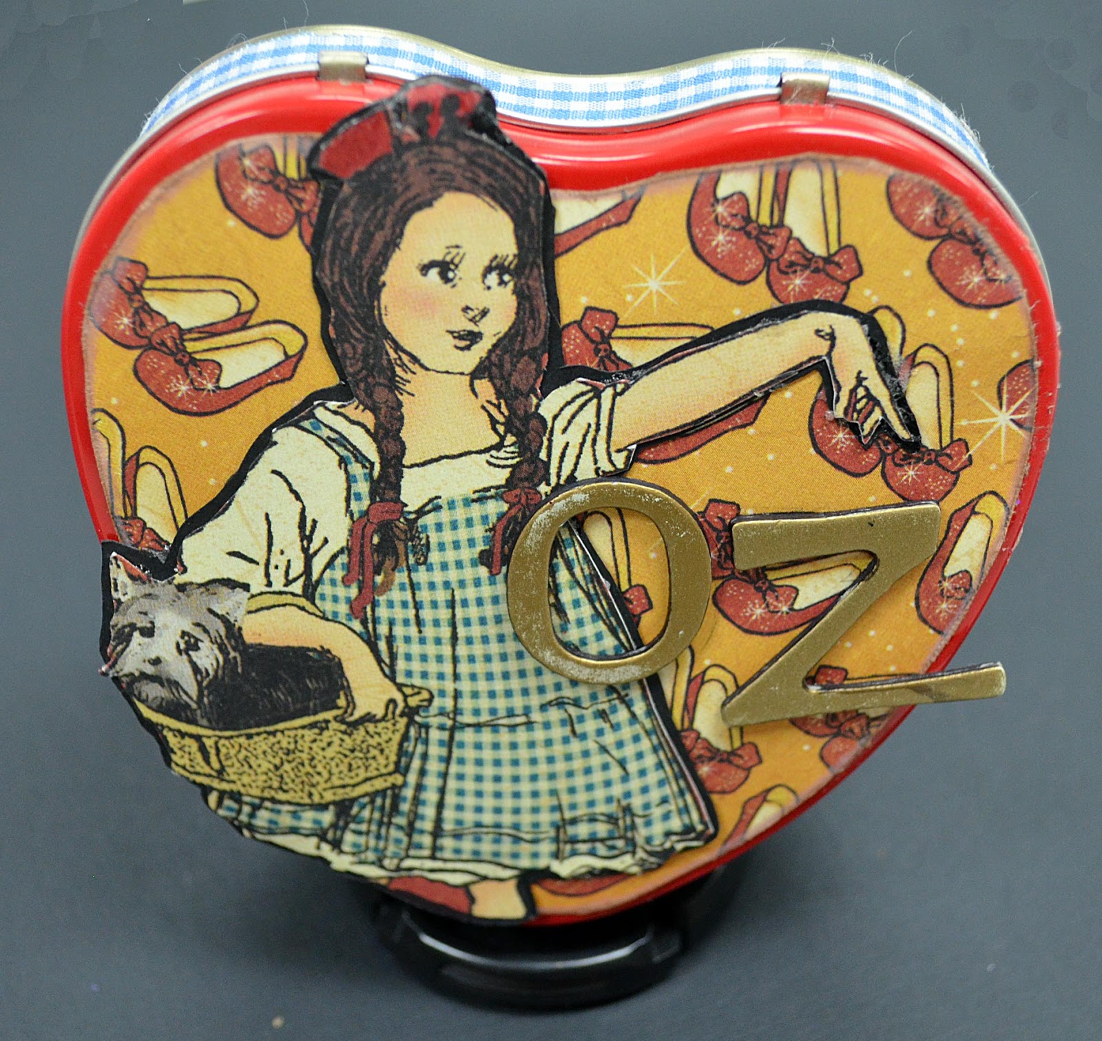
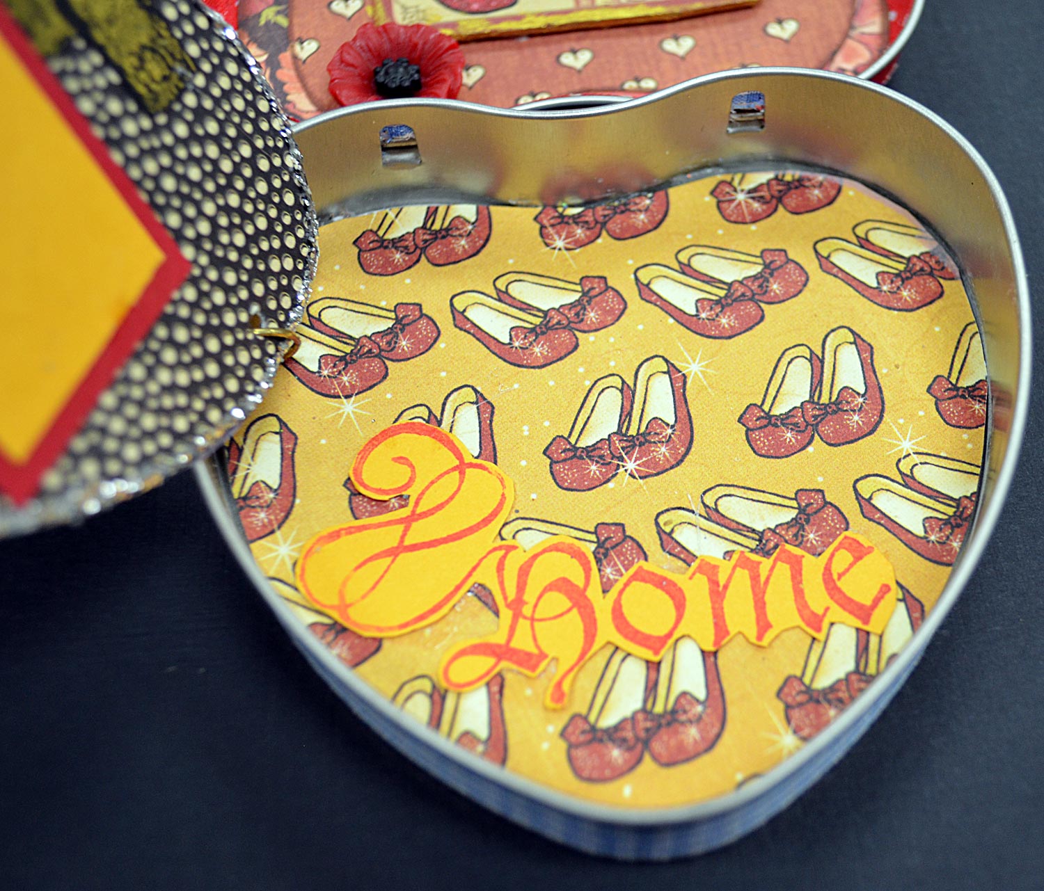
5. The Magic of OZ - Altoids Tin Mini
This adorable little album exists because I visited 7-11 at just the right time.  I have not seen these tins anywhere else.  And I think the 8x8 Magic of OZ paper fits the colors,  size and shape perfectly.  The inside pages can be flipped through or pulled out like a banner of hearts. All the pages were made using the paper inserts from the mints as a template for the hearts. So simple and yet so sweet. More information about how I made this mini and tin can be found in my full length post.


6. Secret Garden - Altered Book Art
For my final project I have made an altered niche book. This is my first altered book, although I have been interested in them for a while.  To make this piece I glued the pages of the book together and cut out a shadowbox or niche into the middle of the book.  Then I decorated the book using the Secret Garden papers. In the niche I fussy cut the little girl and flowers to create a diorama. I used some pieces from the 8x8 and 12x12 papers to create an illusion of scale and more dimension. I also created a cover and title page for my Secret Garden book.  And in the spine there is a hidden bookmark from which hangs the key.  I hope you enjoy this project as much as I did making it.  For more pictures and details about the Secret Garden art book, visit my full length blog post.