So with out further ado, here are the eleven projects I am submitting for the 2014 Graphic 45 design team audition.
Olde Curiosity Shoppe Puppet Theatre:
I have always loved the feel of the Olde Curiosity Shoppe paper line, which makes me think of the The Imaginarium of Doctor Parnassus or the opening credits of Oz, The Great and Powerful. It has a weird, wonderful, wacky, creepy and fun vibe in the images and words used in its design. To reflect that, I decided to do a project that combines that feel with stamps like Catherine Moore's Doll Parts to create my own world of whimsy, weirdness, and wonder.
When you open the curtains of the puppet theater, you will enter five different quirky and amusing worlds. Each page has at least one puppet or doll that can be played with on the "stage" in front of one of the five set pieces- a ballroom, a forest, under the sea, a circus and the curiosity shoppe itself. On the back of each page, there is a space to write the story of each of the puppets. I used various different multimedia techniques, such as modeling paste and stencils, to create dimension in each scene.
(I have included a You Tube video of me displaying the theatre and puppets.)
Four 12x12 Layouts
I created four 12x12 layouts, trying to imbue each with a different feel.
"Cats" is a layout featuring Typography. To create this look, t, I layered the paper's different patterns and colors with black card stock to create photo mats with visual depth and interest. I added chipboard and sticker embellishments from the line along with some enamel dots. I feel like this ended up looking very clean for the amount of color and pattern that is on the page.
"Oscar Gold" featuring Curtain Call. For this layout I fussy cut from the paper (one of my faves) and layered it with gold foiled paper and one of the new G45 washi tapes. I love how this layout has the Hollywood glamour that suits the photo.
"California Gothic" featuring French Country. This layout is a humorous twist on the painting American Gothic.To create the 3D sunflowers, I fussy cut matching sunflowers and crumpled one to add texture before layering them together . I then added glitter glue and earl dots to each flower. To finish the layout, I used buttons, and letter stickers.
"A Day by the Bay" featuring By the Sea -- I cut three of the blue papers into two inch squares to make a patchwork background. I then used a stencil with Viva Décor Ferro to create the sand effect. I layered over this a multitude of fussy cut shells and oceanic embellishments. I finished with a piece of twine wrapped around the edge of the whole page. What a great way to commemorate a day out with my father.
These are six cards I created to teach during the past year. They are all interactive or display style cards with fold or features that really show off a beautiful paper. I have included the You Tube videos I made when promoting the classes.
Steampunk Spells Cascading Card and Typography Tag Card
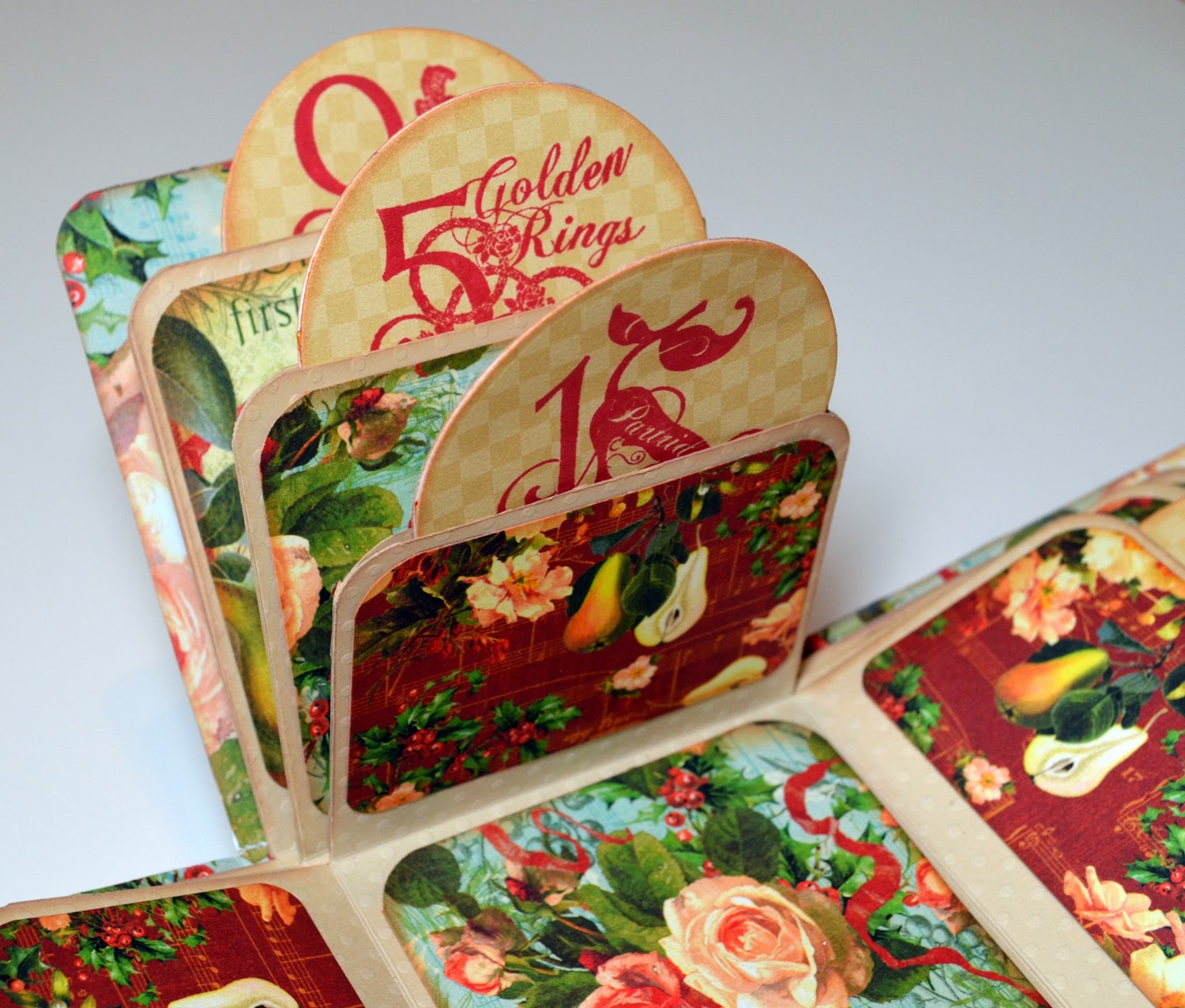
A 12 Days of Christmas Exploding Box
I used the stamps and all three sizes of the Twelve Days of Christmas paper to create this exploding box. I added graduated rounded tags and stamped each of them with numeric stamps for each of the 12 days. The cover is decorated with fussy cut holly, fruit, and other elements. This was originally created as an entry for Graphic 45's December Facebook contest.
THis is a two piece desk set that has been altered using the Typography line. The first piece, a pencil box made from a cigar box, was originally an entry for Graphic 45's Typography Challenge. The second piece is an altered pre-fab crafting desk set from KaiserCraft. On both pieces, after covering them with paper, I added some of my favorite sayings and quotes off the paper. The I completed the look by embellishing the set with copper pipes, washers, and metal embellishments. I love this set so much I am already filling it with crafting goodies.
Marie Antoinette Canvas
Inspired by the work of Julie Nutting, I decided to create a Marie Antoinette multimedia canvas. I drew out my own pattern for the body shape. And then using Prima and other papers I crerated a period out fit from both cut and torn paper. In this piece I used quite a few mixed media techniques, including modeling paste for her hair.
Mad Tea Party Mini Album
Using my eClips paper cutter, I created custom tea party themed shaped pages. I then bound them by hand and covered them in Halloween in Wonderland and Botanical Tea papers. I really enjoyed mixing and matching the old and new lines for this project. I also used the new shabby colored embellishments to create another bond between thru old and the new. And the layered, bottom bound style of the mini album is something I haven't tried before, especially with the custom shaped papers. I have a feeling it will be a favorite of mine to page thru for years to come.
(I have added a You Tube video of myself showing this album.)
Three Piece Suit Cards
These are two really fun cards to make for guys that double as gift card holders. The first one was created using the Proper gentleman collection and the second features the new line, Good Ol' Sport. I was inspired to make them when I had several male friends' birthday parties to attend. I really think they are clever and fun to give.
Steampunk Corset Apron
I created this altered steampunk apron for the 2013 So Cal Shop Hop. To make it, I hand drew an original image of a corset directly on the canvas apron. I then used a combination of paint markers, Sharpie, and a gilding pen to fill in the corset and background. The functioning lace-up front was made using ribbons and eyelets. I also added a faux leather trim, beaded fringe trim, and metal hardware and embellishments. I think the finished piece has a fun trompe l'oeil effect.
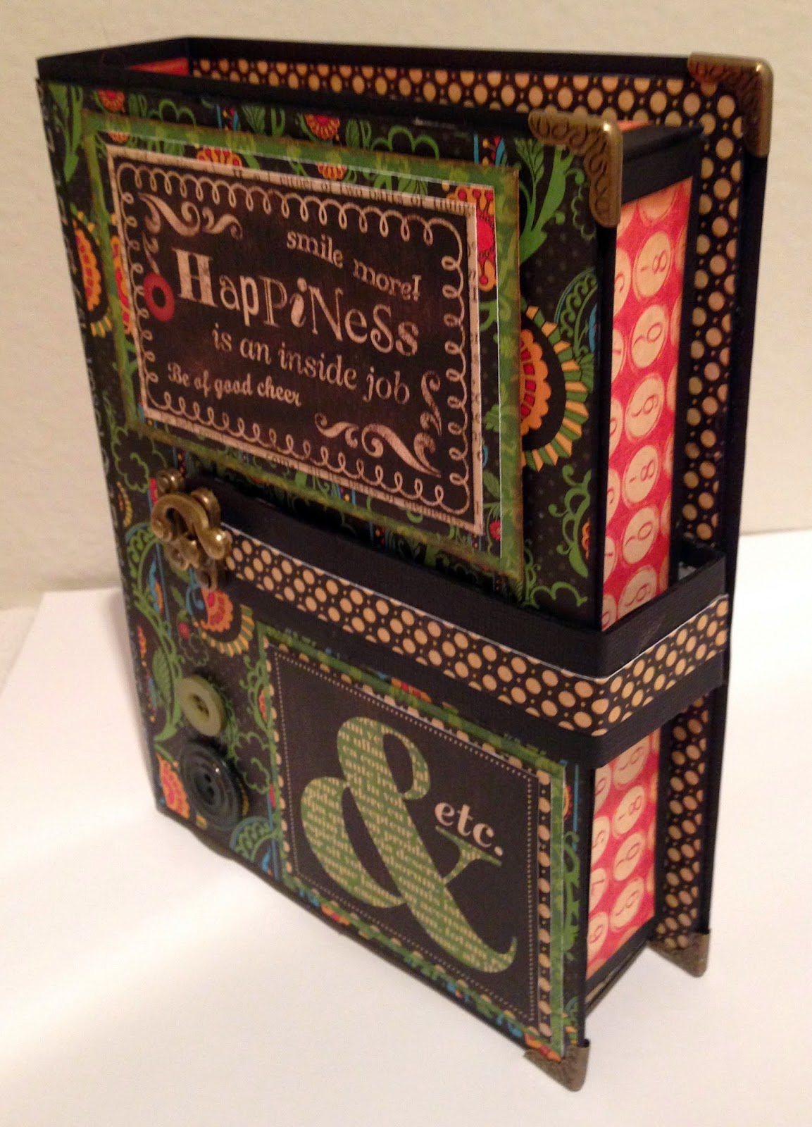
Latched Book Box of Cards
This set was created as a gift for my step brother. I started by making a "book shaped" box using 12 x 24 black card stock and heavy chipboard for reinforcement..I cover the box with Typography paper. The box also features a latched band that holds it securely closed. To fill the box, I made six 4x6 cards with the quotes from the paper line mixed with embossed core'dinations paper, buttons and brads. It made a great "guy" gift that wasn't monotone or boring.
A Ladies' Diary Altered Shoes
To make these wearable pieces of art, I started with an inexpensive pair of flesh tone shoes and decoupaged the entire upper and heel of the shoe with small, torn bits from the A Ladies' Diary line. I then added individual, fussy cut flowers over the patterns. To add a final touch I made a bow from the G45 fabric by Wilmington Prints with a large G45 Staples brad at the back of the shoe, above the heels. I loved this project so much, I bought a second pair of shoes and hope to make a Couture pair - this time with video.
Thank you for taking the time to view my submissions for the design team. I hope you enjoyed seeing them as much as I did making them!


