Monday, December 2, 2013

Grateful for Tutorials to Try & a G45 Challenge

I hope everyone had a Happy Thanksgiving!! I had a great time with my sweetie and some friends.  And am both excited about the upcoming holiday season and a bit nervous about getting my craft gifts completed in time.  But one thing I will have ready are thank-you cards.

For November, Graphic 45 had a new challenge- making thank-you cards.  I decided to add my own twist to the challenge.  I decided to make cards from different tutorials I had seen, liked and bookmarked.  So here are the six thank-you cards I made plus a bonus birthday card.

Card #1 - Pop-up box card

For this card I used the Secret Garden paper by G45.
I started with the 6x6 pattern paper and added embellishments and
fussy cut flowers from the 8x8 and 12x12 designer papers. 
The "Thank You" stamp is by Just Rite. 
I first saw this card on Graphic 45's Facebook page (which linked here)
The original tutorial (which is what I based my card on) is here.

My conversions from metric to inches:
A4 paper =  11.7 x 8.3 inches
7cm = 2.75 inches (score at 2.75, 5.5, 8.25 & 11)
15cm = 6 inches.
(folded flat)


Card #2 - Infinity folding card

OMG! I had seen these and figured they would be so complex and hard to make. But the the tutorial I found made it so clear and had directions so simple that I want to make a ton more.

Here is the awesome tutorial.

I used the Communique paper and a Cas-ual Friday stamp.

Card #3 - Cascading card

 
 Another card that looks very complex and cool, but has an easy to follow tutorial.  I used G45's Steampunk Spells for this card.  I fussy cut balloons (larger in front smaller in back) and gears to decorate this card.  The stamp is by Just Rite.

The tutorial I used is here.
(I had trouble fitting the page in diagonally. so I used a ruler)

Card #4 - Tri-shutter card

I really like how this card turned out.  I think the fussy cut ladies and roses from G45's Ladies' Diary look so cool on this format.  The stamp is by Avery Elle.  The card looks nice closed and open on a table.  So I feel like this is a really cool style of card and I had never heard of it before.

The tutorial I used is here.

Card #5 - A Twisted card

I wasn't sure abot this card at first, but the pockets that the style made really made me think. There are so many cool things that can go in pockets! Tags or gift cards or movie tickets or photos...the list hoes on.  I used G45's Le Cirque and On the Boardwalk papers and fussy cut some bathing beauties for the pockets.  Stamps by Inkdinkadoo and Elle Avery.

Tutorial here. Watch whole thing for more ideas.

Card #6 - Napkin fold card

This card style was suggested by a facebook crafting buddy, Shannon.  I really wasn't crazy about the size and shape unfolded, but really wanted to make this card work.  So I changed it slightly from the tutorial and made it smaller. (I started with an eight inch square and scored at two inches from each side)  I mainly used the 6x6 Secret Garden paper with a couple fussy cut flowers from the 12x12 paper.  The edges arepunched with Martha Stewart's Scallop Three Dot punches. 

 I ended up really liking the smaller size and think it looks like a quilt...sorta.

Here is the tutorial. Video at bottom.

Bonus Card - "Birthday Suit" card

This card was done with th G45 Proper Gentleman paper.  I wanted to do a suit card, but couldnt fond one that was perfect. So I combined a cou[;e of tutorial I saw.  Stamp is Avery Elle.

I plan to play with this card idea more and maybe add a more detailed (tutorial?) post about it.

Tutorial 1 (in Estonian!)
_____________________________________

I hope you enjoyed seeing the tutorials and the cards they inspired me to make with Graphic 45's beautiful paper.  What are some of your favorite card styles? I would love to learn some more new styles!

Thursday, October 10, 2013

My Methods for Copic Skin & Hair Part 2: Darker & Curlier

This is part two of my Copic technique.  Again I can;t say if I am doing this the proper way.  I am not Copic certified or anything but self trained.  I learned most of what I know about drawing and shading from years of practice and learning how to look at objects in real life.  To be honest I think that is where you can understand shading the best, by looking at a photo and seeing where the lights and darks fall.  In theis post I am going to go over a darker skin tone, black hair with Cool grey and how I color curly hair,  I am using another digi stamp image by La-La Land crafts.  It is called "Coloring Marci." (Again, please respect the artists and designers of these wonderful stamps.)
These are the colors that I have choosen for my skintone. E11, E13, E15 & E18.  I begin by laying down E11 (the lightest color) over the whole face.  It is ok if it is a bit streaky because there will be additional layers of color to cover it and even it out,
I added a shadow in E13 around the edge of the face and below the hairline to start giving depth.
I then blended the shadow using E11
   
 I then added more depth by making a darker shadow line in E15.
 And blended it with the E13 and E11.
 (For a medium skin tone you could stop here and make sure everything is well blended.) I added a final layer of shadow with the E18.
And i blended it with the E15-E11 pens.
For blush and lip color I used the E04.
 Now I am ready to color the hair.  I am starting with the area above the headband.
And for the black hair I am using: C9, C7, C5, C3 and C1
I started with the C7 along the top for head and behind top of headband. (This part will be similar to the straight hair we did in part 1.)
 I followed that with a layer of the C5.
 Then I blended in the C3.
 And lastly the C1 was blended in.
 I then added a scond layer of color over the first.  I started with the C9. to make the hair even darker.
 I then blended in the C7....
 C5, C3....
 and C1. And that finished the top part of the hair.
Now using the same set of colors I am starting on the curls at the bottom.
Using the C9 I start by deciding where the darkest parts of the hair would be.  I choose to make shadows below the headband, at the back of hair (by neck and behind shoulders), beneath the ears, the tips of the curls and anywhere the hair goes behind other hair. 
 I then blended that out in the direction of the curls with the C7.
 And the same with the C5.
 And then blend in the C3.
 And finally the C1. 
 And here is finished coloring of the darker skin and curly hair on the La La Land Craft's "Coloring Marci" stamp.
Thank you with sticking with me through two long tutorial posts.  I hope they help explain my thought process when coloring hair and skin with Copic markers.  I am going to add some other projects where I have used these techniques at the bottom of the post.  And I would love to see how you color hair and skin.  Have fun crasfting and coloring and I will see you again soon!

Another LaLa Land Crafts stap "Winter Marci" I colored her lips a deeper red here.

Here is one of the Gorjuss girl stamps with the darker hair and a much looser curl.

Thursday, September 26, 2013

My Method for Copic Skin & Hair. Part 1: Light Skin & Brown Hair

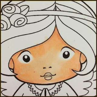
When I color with my Copics at a crop or somewhere I often get asked how I do skin and hair.  (Ok I get asked more about hair, lol) So I wanted to make a post that kind of explains my method.   For this post I am going to do a pale skin tone with a medium (golden?) brown hair.  I am using a La La Land digi stamp - Angel Marci for my demo pictures. So, here we go!
These are the colors I am using for the skin- E000, E00, E02 & E11. To Start, I cover the whole face with E000. This first layer may be streaky or uneven- it will get covered. I try to leave a blank area around the eyes.
The next step is to add a line of the E00 around the hairline, ears and cheeks. basically any where there would be a shadow or where the edge of the face recedes.  Anything that is further away should be a bit darker than what is closer to the viewer. I then go over the lines of E00 with E000 with a "flicking" motion toward the center. (Trying had to avoid the eye area I left blank.)
I then basically do the same process with the E02 of shading around the edge of the face the blending toward the center. First with the E00, Then the E000.  The skin will start to get a gradient or I guess ombre effect that gives a more rounded appearance.
And this is the last of the flesh color pens added in the same way, E11. Which is then blended out with the E02, Then and E00 and finally a last blend out with the E000.  This last blend is where I try to get the skin even and well blended.
This is where I would add blush or lip color. I used R20 here. (ou will see it better on hair pictures.) and blend it with E000 to soften.

 This is also a good point to do any clean up with the blender pen. If there are any stray marks in the eye area or hair they an be gently lightened with the blender.

Now on to the hair!
I choose A blending set in the E20 range. The lightest and darkest tones will be used sparingly so focus on middle shades when picking a color. I wanted to do a mid range brown with a golden sheen to it.
I start with the second darkest coloe In this case I am starting with the E27.  I color the roots or part of the hair this color. I also color the tips of the hair and out side edges or shadows.  Remember that we want to make the head appear rounded by having darker shades further away.
I then feather out the darker color with the next two colors (E25 then E23.)  I blend in from the darker colors toward the middle where the highlight or lightest color will go.  When I first stated (and sometimes still if I am being very exact) I will make a light curved mark with the lightest color to show where the highlight should be.
I now add the lightest color over pretty much all the hair to blend and soften any hard lines and add the highlight color.  And now I move to the second "layer." of color.
Starting at the part, tips and edge of head, again, I color in a small amount of the darkest color- E29.  You want to use a really light hand and just to a bit to deepen the shading that we already put down with our first layer of color.
I then blend toward highlight from darkest to lightest like I did before.  Adding E27 and E25.
And then E23. As you can see the highlight area is much smaller on this layer.  But we only want a sliver of that bright sheen for it to look more natural or real.  One of the best suggestions I read or heard when I was learning about Copics was to look at magazine photos. Ads (especially for make up or shampoo) will have girls with super shiny hair which is the look I am trying to duplicate. And I can look at how their hair is naturally shaded for guidance.
I add one more blending layer with the lightest shade (E21) and stop.  I left some harder lines between some shades, you can take more time and blend it out softer.  But basically this is my method for hair.

I suggest you look at and try all the different techniques or methods out there. (There are so many tutorials!) And find a method for coloring and shading with Copics that feels right to you.  Because there is no right way to color there is just fun. So go have some!!

Below are samples of some cards I made with Copic colored stamped/digi images.  All images are the property of the artist/manufacturer please respect that!!

This is another La-La Land digi stamp by the wonderful Irina Blount.  It is called "Best Friends Luka."  I colored the hair a similar brown, but went a tad darker on the skin tone.

This card features a stamp by The Greeting Farm called "Cheeky Nurse."  I used the same technique with a strawberry blonde coloring

These adorable dolls are made with the Julie Nutting/Prima stencils. While most of the image is done with paper piecing, the hair on all four were colored in Copics. 

 
And lastly, another La-La Land digi card.  On this one I combined "Umbrella Marci" with some of the accessory stamps Irina designed. The hair color is more of a red brown, but I used the same technique of dark to light shading and layering.

Coming soon - Part Two: Darker skin tones, and Curly hair techniques.